Data Scientist · AI Engineer · NLP — Learning Journey Portfolio
Ninditya Salma Nur Aini · 2026
Learning
Journey
Portfolio
Apple Developer Academy Indonesia — 2026 Application
From a Bahasa Indonesia NLP thesis in 2021 to building production AI systems in 2026 — this portfolio traces a continuous learning trajectory across five phases. Each phase represents a new capability: understanding language, analyzing data, engineering LLM systems, collaborating in real teams, and working with vision models. Every project here was built, evaluated, and shipped. Nothing is hypothetical.
01
NLP Foundation
LSA Chatbot Thesis (2021) · Sentiment Analysis ML vs GenAI (2023–2026)
02
Computer Vision
StudioAI Stable Diffusion (2024) · GeoAI U-Net · AquaSense YOLOv8 (2025)
03
Data Science
Student Dropout · Employee Attrition · Air Quality · Talent Match Intelligence (2025)
04
AI / LLM Systems
Banking Intent Router · RAG Chatbot · NutriPal AI (2025)
05
KADA — Team Projects
Yorindo EM·U (event platform) · CineTrack (cinema analytics) · 2026
Not a collection of scattered experiments — a consistent learning arc. Started with classical NLP in 2021, expanded into Computer Vision and Data Science, then production-grade AI/LLM systems, and finally team-based software engineering. Each phase built on the one before it. The unifying thread: the question of how to represent meaning numerically — LSA (2021) → SBERT (2025) → diffusion latent space (2025) — same problem, different domains.
What's in This Portfolio
| Domain | Projects | What It Proves |
|---|
| NLP & Language 2021–2026 | LSA Chatbot · Sentiment Analysis | Model from scratch, Bahasa Indonesia, 4-year longitudinal benchmark of ML vs GenAI |
| Computer Vision 2024–2025 | StudioAI · GeoAI · AquaSense | Generative diffusion pipeline · Satellite segmentation GIS end-to-end · YOLOv8 evaluation + IAA |
| Data Science 2025 | Dropout · Attrition · Air Quality · Talent Match | Full pipeline: EDA → model → dashboard → stakeholder deliverable. All IDCamp Expert level. |
| AI / LLM Systems 2025–2026 | Banking Router · RAG Chatbot · NutriPal | Production: cost engineering (−96% LLM cost), personalization, full-stack AI app solo in 3 weeks |
| Team & Software Eng. 2026 · KADA | Yorindo (Backend) · CineTrack | Agile SDLC · AI-assisted dev (Claude + Codex) · REST API · Epic → User Story · real team delivery |
What's Consistent Across All Phases
Engineering Decisions, Not Just Results
Every project explains why specific choices were made — metric selection, model choice, data strategy, architecture trade-offs. The goal is to show a pattern of thinking, not a portfolio of accuracy numbers.
Failures Are Documented
GeoAI F1 35% (data bottleneck, honestly diagnosed). Sentiment analysis data leakage — caught, fixed, re-reported. Air Quality first submission rejected, revised. The failures are here because that's where the learning happened.
Real Deliverables, Real Constraints
Not just model notebooks — production deployments, stakeholder dashboards, client PowerPoints, live apps. Every project had a real audience beyond the author.
PHASE 01
NLP Foundation
2021–2026 · where it started
93.2%
Accuracy
LSA + KNN (vs 92.1% baseline)
−35%
Compute time
17.97s vs 27.49s
10-fold
Cross-validation
90% train / 10% test
Why this project started everything: Informatics department staff were manually answering the same student questions, limited to office hours. I built a chatbot that answers 24/7. But more importantly — I learned that feature representation matters more than model choice. Switching from raw TF-IDF to LSA-projected features improved both accuracy and speed, using the exact same KNN classifier. This insight — that the representation of language determines what models can learn — became the thread I followed into everything that came after.
Web App — Pipeline Visualization

Web interface showing the full NLP pipeline step-by-step: input → preprocessing → TF-IDF → SVD decomposition → LSA projection → KNN → answer. Built to make the model interpretable, not just usable.
Telegram Bot — Production Deployment
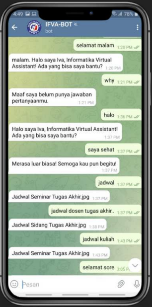
Deployed as a Telegram bot accessible to all informatics students 24/7. Answering FAQ queries about academic administration without staff involvement.
Architecture & Engineering Decisions
| Component | Approach | Why |
|---|
| Vectorization |
TF-IDF → SVD (k=661) → LSA projection |
LSA captures semantic similarity — "biaya" and "pembayaran" map to same latent dimension. KNN baseline couldn't resolve synonyms. |
| Stemming |
Nazief-Andriani (Sastrawi library) |
Indonesian morphology has complex affixation — English stemmers fail completely. "mendaftarkan", "pendaftaran", "daftar" must reduce to same root. |
| Distance metric |
Manhattan distance (vs Euclidean) |
Compared both empirically; Manhattan performed better on LSA-projected sparse vectors in this domain. |
| SVD from scratch |
Implemented in PHP using NumPHP + Math-PHP |
No off-the-shelf NLP library for PHP that handled SVD. Precomputed 59 MB JSON matrix stored for fast inference at query time. |
| Deployment |
Web app + Telegram Bot API (dual interface) |
Staff wanted web admin; students wanted Telegram. Same backend, two UIs — the model didn't change, only the interface layer. |
Key Insight
The feature space, not the classifier, drove the improvement. This is the core lesson I've applied to every NLP problem since: get the representation right first, then worry about the model.
Indonesian NLP
Built my first mental model of low-resource language challenges: slang, abbreviations, affixation, lack of word boundaries. Standard English pipelines were unusable — every step required language-specific adaptation.
Continuity
The SBERT + LinearSVC system in Banking Intent Router (2025) is conceptually the same pipeline at a different scale: dense semantic embedding → classifier → confidence thresholding. Four years later, same idea, better tools.
Stack: PHP, MySQL, Bootstrap 3, jQuery, Telegram Bot API, Rubix ML, Sastrawi (Indonesian stemmer), NumPHP, Math-PHP
93%
BiLSTM accuracy
best performer
85.3%
GenAI zero-shot
7.7% below BiLSTM
772×
LSTM faster
0.25ms vs 195ms
$0
ML annual cost
vs $62+ GenAI at scale
Real motivation: At my previous job at Flip I managed prompts for a GenAI-based sentiment system — but had no way to measure whether my changes actually improved accuracy. This extended project answers that empirically: three approaches on the same 11,000-row Bahasa Indonesia Twitter dataset, measured identically. The result surprised me: a BiLSTM I trained in-house outperforms GenAI API calls on accuracy, speed, and cost simultaneously. GenAI is not universally better — context determines the right tool.
BiLSTM Training History — Convergence at Epoch 8
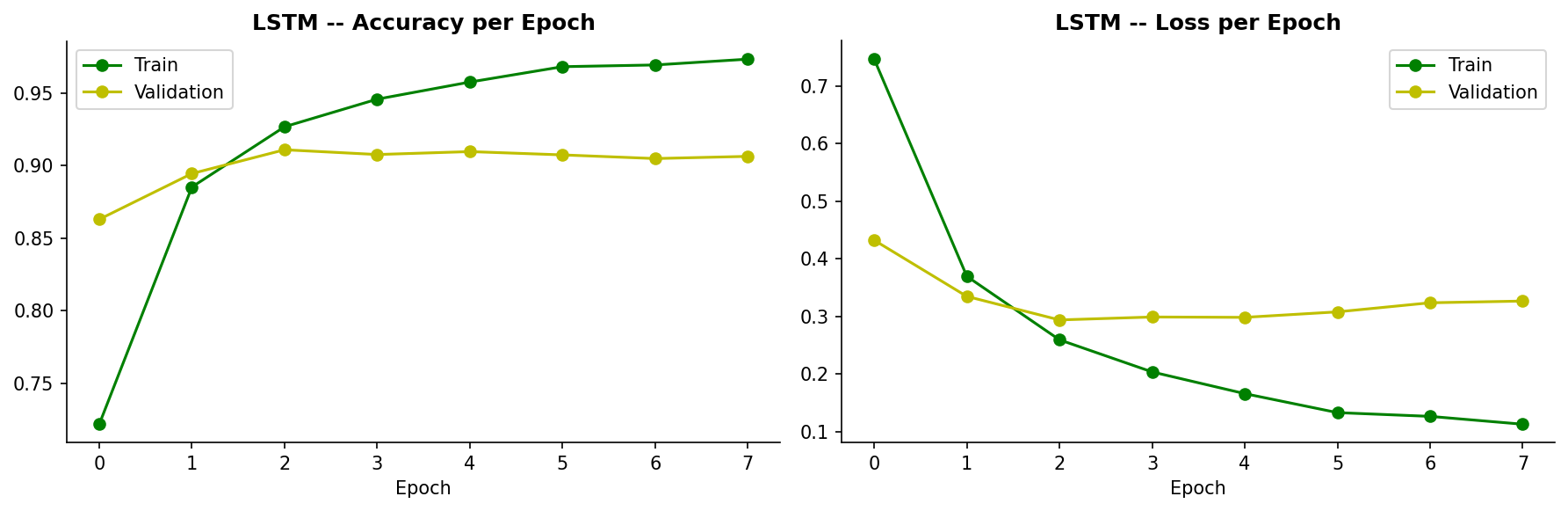
EarlyStopping(patience=5) + restore_best_weights. Converged at epoch 8 without overfitting — effect of SpatialDropout1D(0.4) + L2 regularization on short, noisy tweet inputs.
Accuracy Comparison — All Models & Configurations
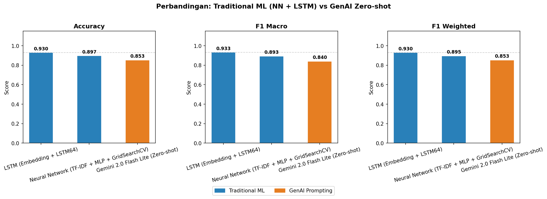
BiLSTM (93%) outperforms all baselines. GenAI zero-shot (85.3%) is below ML classical. Few-shot examples from wrong domain (e-commerce) actively hurt GenAI accuracy — domain mismatch makes examples noise, not signal.
Key Engineering Decisions — BiLSTM Architecture
| Decision | Configuration | Rationale |
|---|
| Embedding | Vocab 100,000 · dim 128 | Captures Bahasa Indonesia slang: "gue", "gapapa", "tdk", "udh", "bgt" — standard tokenizers miss these |
| Regularization | SpatialDropout1D(0.4) + L2(0.001) | Tweets are 5–30 tokens — high overfitting risk without explicit regularization on short, noisy inputs |
| BiLSTM | 64 units · recurrent_dropout=0.4 | Bidirectional context detects irony and implicit negative sentiment — "bagus banget ya" (sarcasm) requires both directions |
| Class Handling | Neutral class oversampled before training | Without this, neutral recall collapsed below 30% — it's only 10% of the dataset (positive 58%, negative 31%) |
| Data Leakage Fix | KFold strictly on training set only | Found a bug from 2023 submission: KFold was applied across full dataset including test. Corrected — honest accuracy is 91.09%, not the inflated 92%. |
GenAI Insight
Zero-shot was the best GenAI strategy — outperforming 3-shot, 5-shot, 10-shot, and CoT. Few-shot examples from the wrong domain added confusion, not signal. Domain adaptation matters more than example count.
Cost Reality
GenAI at 10K requests/day: $62/year (zero-shot) to $304/year (CoT). BiLSTM: $0/year after training. For a known, bounded domain, the trained model wins on every dimension.
Thread to 2021
Same insight as the thesis: representation quality and domain fit matter more than model sophistication. A well-designed LSTM on the right domain beats a general-purpose LLM that has no domain anchoring.
Stack: TensorFlow/Keras (BiLSTM), scikit-learn (TF-IDF + MLP + GridSearchCV), Flask API, OpenRouter (Gemini 2.0 Flash Lite), SQLite (slang normalization), Python
PHASE 02
Computer Vision
2024–2025 · Stable Diffusion · U-Net · YOLOv8 · Gemini Vision
4
Schedulers compared
Euler A · DPM++ · DDIM · others
7.5
Optimal CFG scale
measured empirically (not assumed)
30
Optimal steps
diminishing returns past this
3
Masking approaches
manual · CLIPSeg · canvas
Goal: Not just to generate images — but to understand what each hyperparameter actually does. Built from scratch using HuggingFace Diffusers (PyTorch), not a high-level wrapper, so every decision is observable and measurable. Two-stage pipeline: base model at denoising_end=0.8, refiner at strength=0.2 (latent-space passthrough). Two Streamlit tabs: Generate + Edit (inpainting/outpainting).
Systematic Hyperparameter Experiments — Controlled Comparisons

CFG Scale: 2.0 (too loose) · 7.5 (optimal) · 15.0 (over-constrained, saturated). Finding: high CFG doesn't make the model "understand better" — it just weights text conditioning more heavily until it damages visual coherence.
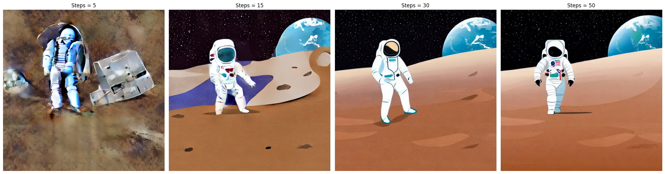
Inference Steps: 5 (incoherent) · 15 · 30 (optimal) · 50 (diminishing returns). Finding: 50 steps costs 66% more compute than 30 with no significant quality gain — denoising has already converged by step 30.
Inpainting — CLIPSeg Auto-Masking + 3 Approaches
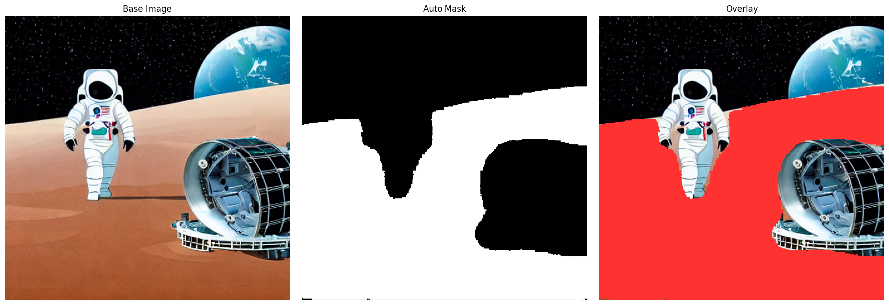
CLIPSeg auto-mask (CIDAS/clipseg-rd64-refined): user types a text description → model generates mask automatically via sigmoid thresholding (>0.5). No manual painting required. Compared against hardcoded NumPy masks and Streamlit canvas drawing.
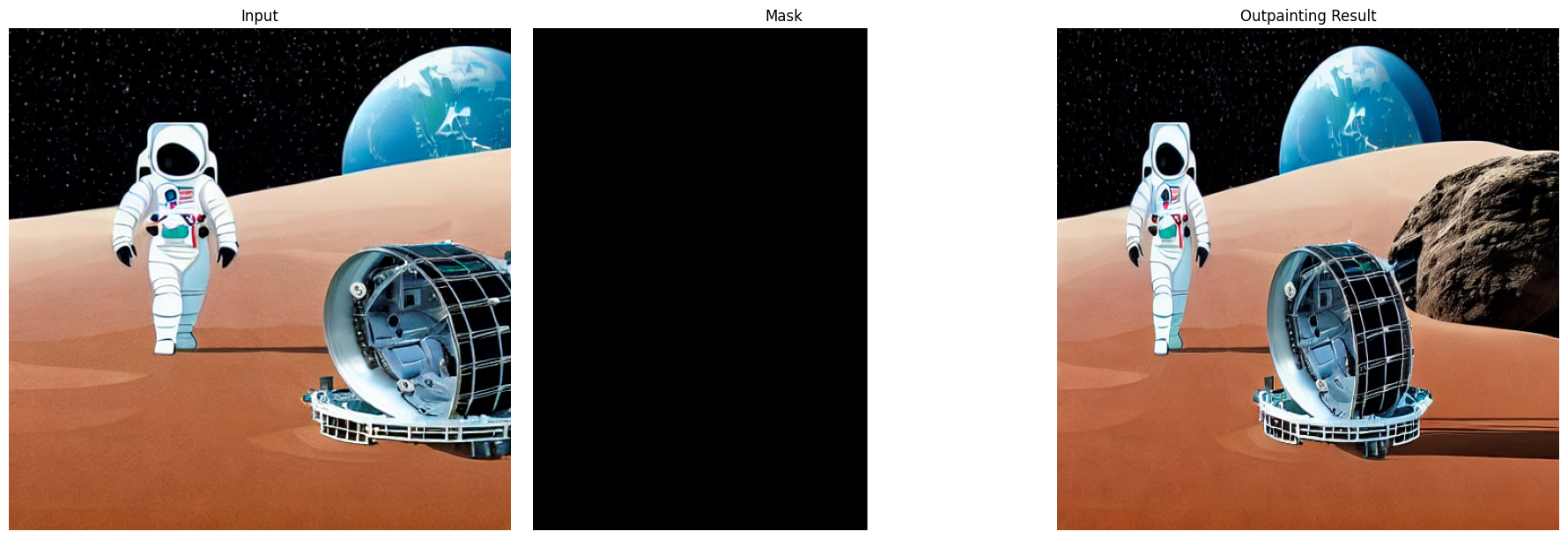
Outpainting (zoom-out effect): pad image with zeros → generate mask for expanded area → inpaint. Chained 3+ iterations with 128px expansion per pass to build larger scenes from a starting image.
Architecture Decisions
| Decision | Implementation | Insight |
|---|
| Code structure | logic.py (pure functions) + app.py (Streamlit UI) | Separating logic from UI made functions individually testable and reusable across both generation and editing tabs |
| Model caching | @st.cache_resource keyed by scheduler name | Reloading 3.44 GB model on every rerun was impractical — cache persists across sessions, scheduler hot-swaps without re-download |
| Base + refiner pipeline | base denoising_end=0.8 → refiner img2img strength=0.2, output_type="latent" | Latent-space passthrough between base and refiner avoids decoding/re-encoding artifacts — sharper fine details on faces and textures |
| Scheduler choice | DPM++ for flat illustration, Euler A for photorealistic | Schedulers are not interchangeable — domain of the target image matters. Measured empirically across same prompt, same seed, different schedulers. |
Core Insight
Diffusion is guided denoising, not iterative improvement. 30 steps vs 50 steps is a compute budget question, not a quality question — the model has already converged. CFG is a text-vs-image weighting parameter, not a "comprehension" dial.
CLIPSeg
Auto-masking via text description (CIDAS/clipseg-rd64-refined) reduces the skill floor for inpainting. User describes what to replace in natural language → model generates binary mask → Stable Diffusion inpaints. Multimodal: vision model driving vision model.
Thread to Phase 1
This is the same underlying question from the LSA thesis: what is the right representation? For language: TF-IDF → LSA → SBERT. For images: pixels → latent space → guided denoising trajectory. Different domain, same epistemological curiosity.
Stack: Stable Diffusion v1.5 (runwayml/stable-diffusion-v1-5 · 3.44 GB), HuggingFace Diffusers, CLIPSeg (CIDAS/clipseg-rd64-refined), Streamlit, PyTorch, streamlit-drawable-canvas, pyngrok (Colab deployment)
35.3%
F1-Score (Dice)
U-Net baseline · binary seg
87.9%
Overall accuracy
threshold 0.90
6×
Data augmentation
190 → 1,140 tiles
8
Grid search combos
LR × Filters × Dropout
Problem: Detect and segment geospatial objects from satellite/aerial imagery (GeoTIFF) end-to-end — from raw raster data with coordinate references to a georeferenced mosaic prediction output ready for GIS analysis. Challenge: Only 190 labelled tiles available. Augmentation strategy (6× via Albumentations: flip, rotation, affine, brightness/contrast) was the primary lever, not architecture changes. The full GIS pipeline — tiling, training, and stitching predictions back into a georeferenced GeoTIFF — was built from scratch.
Prediction vs Ground Truth — Binary Segmentation Output

Left: Input satellite tile. Centre: Ground truth mask. Right: U-Net prediction at threshold 0.90. The model learns edge structure but struggles with small disconnected objects — a data volume problem more than an architecture problem.
Training Curve — Loss and Dice Coefficient per Epoch

Training and validation Dice coefficient per epoch. The model converges but validation gap indicates limited generalisation from 190 original tiles — confirmed by grid search: architecture changes (filters, dropout) mattered less than expected.
Full GIS Pipeline Architecture
| Stage | Approach | Output |
|---|
| Input | Raw GeoTIFF + Shapefile (vector masks) | Georeferenced raster with coordinate system preserved |
| Tiling | Sliding window → fixed-size tiles (overlap) | 190 image-mask tile pairs for training |
| Augmentation | Albumentations: horizontal/vertical flip, rotation, affine transforms, brightness/contrast | 1,140 tiles (6× expansion) — critical given data scarcity |
| Architecture | U-Net (encoder-decoder with skip connections), binary output, threshold 0.90 | Per-pixel segmentation mask |
| Mosaic Export | Stitch tile predictions back → georeferenced GeoTIFF | Full-resolution output importable into QGIS/ArcGIS |
Honest Diagnosis
F1-Score 35.3%, IoU 21.5% — but Recall 77.7%. The model detects most objects (high recall) but generates false positives (low precision, 17.6%). Root cause: 190 training tiles is insufficient for this task. More data > better architecture.
GIS Pipeline
Output is a georeferenced GeoTIFF — coordinate system intact, importable into QGIS/ArcGIS for downstream spatial analysis. Not just a visual output; an actionable input to geospatial workflows.
Architecture Choice
U-Net's skip connections carry edge information from encoder to decoder — preserving the spatial detail that pooling discards. That's why U-Net is the standard for segmentation tasks where boundary accuracy matters.
Stack: TensorFlow/Keras, U-Net, Albumentations, GDAL (GeoTIFF I/O), Rasterio, NumPy, Python
67.4%
Precision
plastic waste detection
52.0%
Recall
378 test images
83.2%
Mean IoU
on true positives
0.889
ICC(A,1) annotator
agreement (non-zero rows)
Two connected problems: (1) Evaluate a pretrained YOLOv8 model against a client test set where the labelling scheme differs — model has 5 classes, client uses 1 merged "plastic bottle" class. Required label alignment before any metric is valid. (2) Assess inter-annotator agreement (IAA) on plankton counts across 3 counting methods — determining which method is reliable enough to use as a training label source. Both tasks required deciding what to measure before measuring it.
YOLOv8 Evaluation — Label Alignment Challenge
| Model Class | Plastic? | Approach | Result |
|---|
| plastic_soda_bottles (class 3) | Yes | Merged into single "plastic" class before evaluation | 62 predictions |
| plastic_water_bottles (class 4) | Yes | Merged into single "plastic" class before evaluation | 414 predictions |
| aluminum_soda_cans (class 0) | No | Excluded from evaluation — not in client's GT scheme | 14 predictions (not scored) |
| glass_beverage_bottles (class 1) | No | Excluded | 51 predictions (not scored) |
Inter-Annotator Agreement — Bland-Altman Analysis (CS2)

Three pairwise Bland-Altman plots. M1 vs M2 and M1 vs M3: large negative bias (~−49k cells/mL), wide limits of agreement — proportional bias that cannot be corrected by a scalar. M2 vs M3: near-zero bias (+694), CCC=0.984 — effectively interchangeable. Recommendation: use Method 2 or 3 as reference for model training; exclude or recalibrate Method 1 Green Algae counts.
YOLOv8 Verdict
Not ready for deployment at conf=0.25. When it fires, it fires well (IoU 83.2% on true positives). But it misses 1 in 2 bottles (Recall 52%). Recommendation: raise conf threshold to 0.40–0.50, then fine-tune on hard-negative images. Delivered as 10-slide PowerPoint for client.
IAA Insight
Spearman = 0.630 but CCC = 0.984 for M2 vs M3. Root cause: zero-inflation. Many rows have one method reporting exactly 0, creating large tie-groups that collapse Spearman's rank signal. CCC is the correct metric for this data structure — not Pearson, not Spearman.
Annotation Background
Freelance annotation experience (487 bounding boxes, 312 polygon segmentations, 300-image classification datasets) across LabelImg, CVAT, and Roboflow — which is what makes CV evaluation decisions legible: I know what labelling errors look like from the annotator side.
Stack: YOLOv8 (Ultralytics), Python, ICC (pingouin), Bland-Altman, Pandas, scipy — HuggingFace Hub (model + dataset hosting) — LabelImg · CVAT · Roboflow (annotation tools)
PHASE 03
Data Science
2025 · IDCamp Expert · end-to-end pipelines · analytics
32.1%
Dropout rate
1,421 of 4,424 students
~1,325
Students potentially saved
with early intervention
97.27%
ROC-AUC
XGBoost final model
90.37%
F1-Score
dropout class · 5-fold CV
Business problem: Jaya Jaya Institut's 32.12% dropout rate (2008–2015) had no early warning system — the institution was reacting after students had already left. Solution: detect at-risk students in semesters 1–2 (the only window where intervention is still possible), then route them to the right support: academic tutoring, financial aid, or scholarship referral.
Solution Architecture
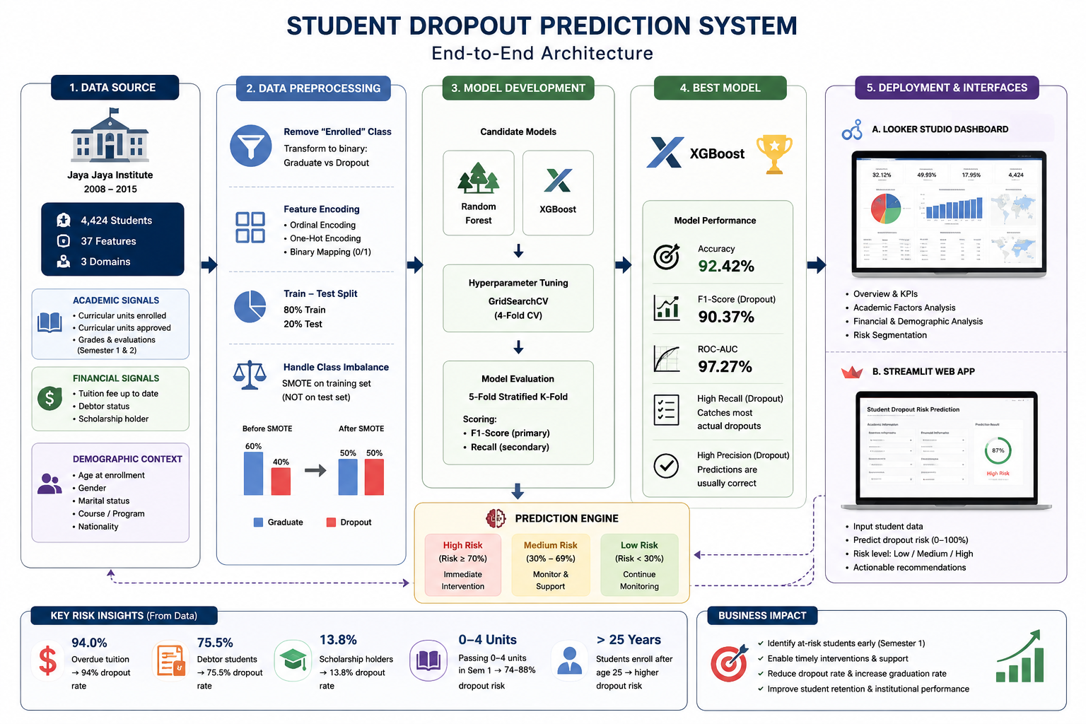
End-to-end flow: business problem → EDA (academic + financial + demographic factors) → XGBoost model → Looker Studio dashboard (administrators) + Streamlit app (student counsellors).
Top Risk Signals — Feature Importance + Observed Dropout Rate
| Signal | Importance | Observed Dropout Rate | Intervention |
|---|
| Curricular units sem 2 approved | 28.6% | 74–88% if <4 units | Academic alert · tutoring from sem 1 |
| Tuition fees overdue | 10.7% | 94.0% | Financial aid referral |
| Enrolled units sem 1 | 4.9% | High if enrolled > capacity | Course load advisory |
| Scholarship holder | 2.7% | 13.8% (−58% vs avg) | Expand scholarship access |
Business Impact — Intervention Estimates
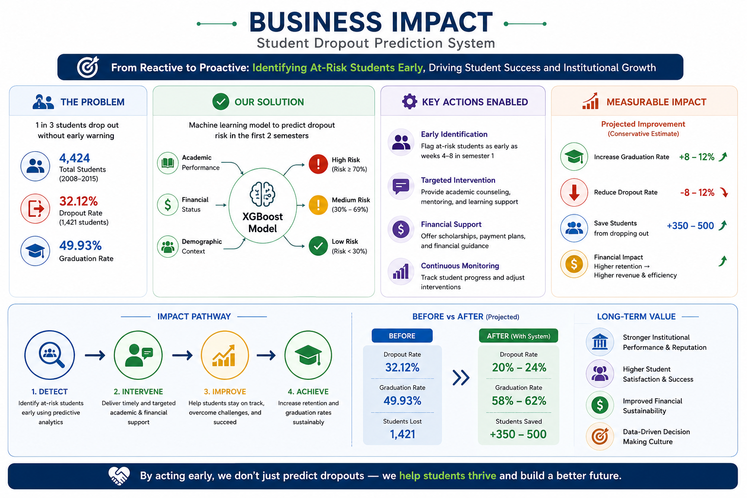
~1,325 of 1,421 at-risk students reachable with four targeted interventions: academic tutoring · financial aid referral · scholarship expansion · course load advisory.
Business Impact
The dashboard's Page 4 estimates ~1,325 of 1,421 dropout students could be reached with timely intervention — if the early warning system flags them by end of semester 1. The four action items (academic alert, financial aid, scholarship expansion, course load advisory) each map to a specific student segment.
Why F1 + Recall, Not Accuracy
A model predicting "graduate" for everyone scores 67.9% accuracy but catches zero at-risk students. Missing a dropout is costlier than a false alarm — F1 and Recall on the dropout class are the metrics that actually measure usefulness in this problem.
Stack: XGBoost, scikit-learn, SMOTE (imbalanced-learn), Streamlit (prediction app), Looker Studio (executive dashboard), Python
86%
Recall
attrition class (XGBoost)
16.9%
Annual attrition rate
baseline Jaya Jaya Maju
5
Metabase dashboard tabs
Docker Compose deploy
50–200%
Cost of missing
one attritor (salary %)
Problem: Jaya Jaya Maju's 16.9% annual attrition had no systematic predictor — HR was reacting, not preventing. Constraint: False negatives are expensive (50–200% of annual salary per missed attritor). Primary metric is Recall on the attrition class, not overall accuracy — a model that predicts "stay" for everyone would score 83% accuracy but be completely useless.
Risk Factor Analysis
| Risk Factor | Attrition Rate | vs Average 16.9% | Recommended Action |
|---|
| Overtime (Yes) | 31.9% | ~3× | Monitor overtime hours per department |
| Salary bottom quartile | 29.1% | ~3× | Benchmark compensation vs market |
| Tenure ≤ 1 year | 34.6% | ~4× | Structured 90-day onboarding programme |
| Age 18–25 | 38.0% | ~4× | Career pathing + mentorship for early career |
| Sales Representative role | 43.1% | highest role | Role-specific retention programme |
Model Choice
XGBoost over Logistic Regression (74% accuracy baseline) — XGBoost achieved 86% Recall on the attrition class. LR's accuracy was misleading: it predicted "stay" for ambiguous cases, hiding the most at-risk employees.
Custom Transformer
Built HRFeatureEngineer — a custom scikit-learn transformer encoding domain-specific features: overtime×salary interaction, tenure brackets, role-level risk flags. Batch predictions write to PostgreSQL via SQLAlchemy for Metabase consumption.
Metabase Dashboard
5-tab Docker Compose dashboard: Executive Summary · Compensation Analysis · Satisfaction Scores · Demographics · Early Warning list (employees above risk threshold, filterable by department). Designed for HR managers — no SQL, no Python required.
Stack: XGBoost, scikit-learn (custom transformer pipeline), SMOTE (imbalanced-learn), SQLAlchemy, PostgreSQL, Metabase, Docker Compose, Python
12
Monitoring stations
2013–2017 hourly
46MB
Raw dataset
6 pollutants
χ²=11,819
Season × PM2.5
p<0.001
2×
Submitted before passing
rigour iteration lesson
Task: Analyse 5 years of hourly air quality data across 12 Beijing monitoring stations — identify worst stations, temporal patterns, and PM2.5 meteorological relationships. First submission rejected by reviewer: questions not Time-bound, EDA missing statistical tests, dashboard not interactive. Revised with chi-square, skewness/kurtosis, Folium choropleth — and passed. The rejection directly shaped my analytical rigour standard.
Statistical Method Decisions
| Analysis Question | Method Chosen | Why Not the Obvious Choice |
|---|
| PM2.5 vs wind speed | Spearman rank correlation | Meteorological data is right-skewed non-normal. Pearson assumes normality — violated here. |
| Season × PM2.5 association | Chi-square χ²=11,819, p<0.001 | Season is a nominal (categorical) variable — correlation coefficients don't apply to it. |
| Station priority ranking | Composite z-score: 0.5·PM2.5_z + 0.35·AQI_z + 0.15·gas_z | Single PM2.5 ranking misses multi-pollutant burden — composite is more actionable for policy targeting. |
| Distribution reporting | Skewness + kurtosis (added on revision) | First submission only showed mean/median. Reviewer required distributional evidence before accepting non-parametric method choice. |
Key Finding
Wind speed (WSPM) is the strongest negative correlator with PM2.5. Winter (Dec–Feb) is consistently the worst period — chi-square confirms the association is not by chance. Gucheng and Wanliu stations score highest on the composite priority index.
Dashboard Design
Interactive Folium choropleth map (by composite score) + Plotly time series drill-down (hourly/daily/monthly) + pollutant correlation heatmap. AQI computed via EPA piecewise linear breakpoints, not raw PM2.5 — the distinction matters for policy interpretation.
What I Changed After Rejection
Added chi-square test with explicit H₀/H₁ framing, skewness/kurtosis justification for Spearman choice, Time-bound question framing (2013–2017 window), and replaced static Matplotlib charts with interactive Plotly + Folium. Passed on second submission.
Stack: Streamlit, Plotly, Folium, Pandas, NumPy, Scipy (Spearman, chi-square), Python · Deployed on Streamlit Cloud
17
Cascading CTEs
single parameterized query
2,010
Employees ranked
by job_vacancy_id
92.52%
Top match score
TGV weighted formula
9.5%
R5 (top performer)
187 of 1,975 employees
Problem: Succession planning at Company X was done by gut judgment — no systematic way to find which of 2,010 employees most closely matches proven top performers (R5, Rating=5). Solution: A 17-CTE PostgreSQL query ranks every employee against the R5 benchmark profile using a weighted TGV formula. AI job profile generation via OpenRouter (MiniMax M2.5) produces structured JSON requirements per vacancy. Served via Streamlit on Supabase (PostgREST backend).
TGV Weighted Scoring Formula
| Dimension | Weight | Scoring Method | Key Differentiator in R5 |
|---|
| Cognitive Ability | 0.30 | user/baseline × 100, capped 100 | Pauli stamina distinguishes R5 — endurance over raw IQ |
| Competency Execution | 0.25 | Competency scores vs R5 median (PERCENTILE_CONT) | SEA +2.10, VCU +1.83, CSI +1.82 — execution competencies, not leadership |
| Work Preferences | 0.20 | Inverse PAPI scales where applicable: (2×baseline−user)/baseline×100 | Lower Leadership G (−0.35) but higher Planning (+0.35) — drives via collaboration |
| Behavioral Strengths | 0.15 | CliftonStrengths top-5 overlap count / 5 × 100 | Futuristic (19.8%), Restorative (19.8%), Intellection (18.7%) |
| Contextual Fit | 0.10 | Categorical: exact match 100/0 (MODE() for R5 reference) | DISC type shows no dominant R5 pattern — high performance is execution-dependent |
CTE Architecture
17 cascading CTEs: benchmarks → PERCENTILE_CONT(0.5) medians → MODE() for categorical references → per-dimension overlap counting → weighted TGV score. All 2,010 employees ranked in one parameterized query by job_vacancy_id.
Counterintuitive Finding
R5 employees score lower on PAPI Leadership G than R3/R4 — but higher on Planning. Strongest cognitive differentiator: Pauli stamina (+3.05), not IQ (−0.59). High performance correlates with sustained output, not raw reasoning speed.
Schema Debugging
Supabase PostgREST caps at 1,000 rows/request — built custom paginated fetch_table(). Docs said GTQ1–GTQ5 as separate columns; actual DB stores single composite value. Always verify live schema against documentation.
Stack: PostgreSQL (17 CTEs, PERCENTILE_CONT, MODE, CUID2 PKs, 6 composite indexes), Supabase (PostgREST + star schema, 11 tables, 180K+ rows), Streamlit 1.40, Plotly 5.24, OpenRouter (MiniMax M2.5), Python 3.11
PHASE 04
AI / LLM Systems
2025–2026 · production systems · cost engineering · full-stack
0.9305
F1 Macro
Banking77 benchmark
−96%
LLM cost reduction
vs all-LLM baseline
~50ms
Avg latency
weighted across tiers
4
Routing tiers
regex→template→RAG→LLM
Insight from the LSA thesis, applied at scale: Four years later — same core idea. Dense semantic representation (now SBERT instead of LSA) + confidence-based routing instead of hard classification. The 2021 thesis showed that representation quality changes outcomes more than model choice. This project shows that routing decisions based on confidence scores change economics — 96% cost reduction by never calling an LLM unless the confidence of cheaper tiers genuinely fails.
System Architecture — 4-Tier Routing Pipeline
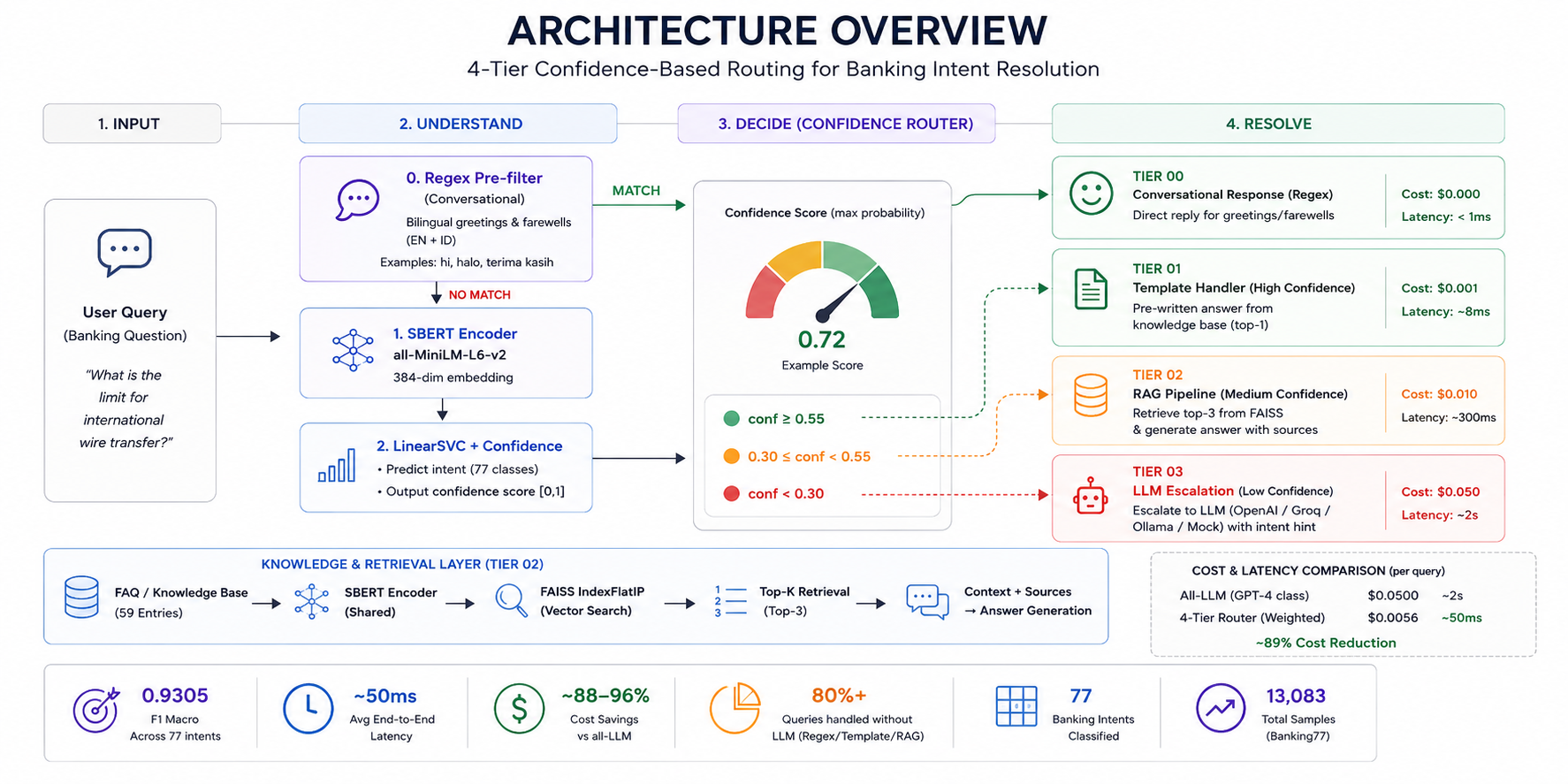
Query → SBERT embedding (384-dim) → LinearSVC confidence scoring → routing decision → tier handler. Tier 0: regex (<1ms, $0). Tier 1: template (≥0.55 conf, ~8ms). Tier 2: RAG+FAISS (0.30–0.55, ~300ms). Tier 3: LLM fallback (<0.30, ~2s). 12 Prometheus metrics monitored via Grafana Cloud.
4-Tier Routing Economics
| Tier | Trigger | Handler | Latency | Cost/Query |
|---|
| 0 — Regex | Exact pattern match | Rule-based regex | <1ms | $0 |
| 1 — Template | LinearSVC conf ≥ 0.55 | Template lookup | ~8ms | $0 |
| 2 — RAG | LinearSVC conf 0.30–0.55 | FAISS + doc retrieval | ~300ms | ~$0.0001 |
| 3 — LLM | LinearSVC conf < 0.30 | GPT-4o mini / Groq | ~2s | ~$0.001 |
Tiers 0+1 handle ~80% of queries at $0. LLM tier handles only the ~4% the model is genuinely uncertain about — hence −96% cost vs all-LLM baseline.
Grafana Monitoring Dashboard — Live Production Metrics
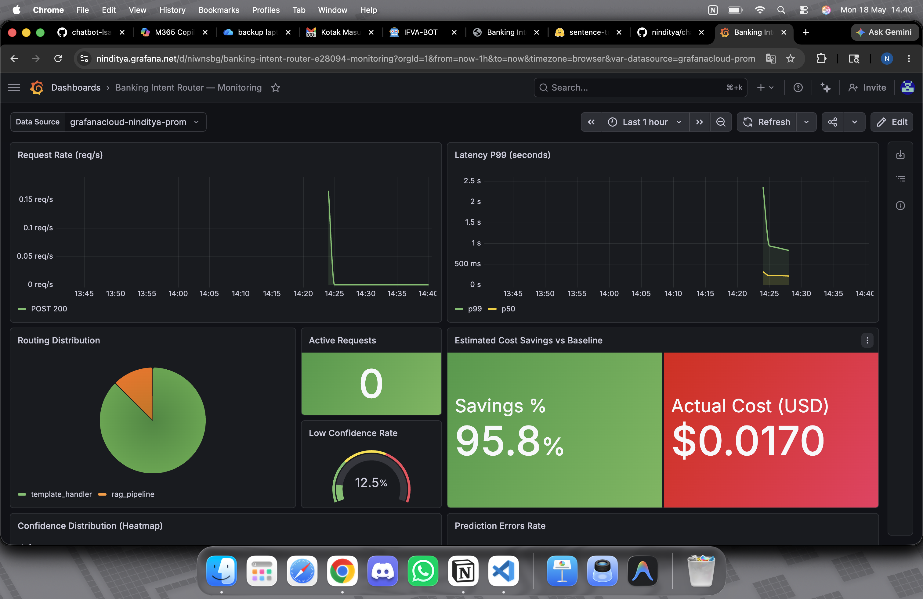
12 custom Prometheus metrics via remote_write (protobuf + snappy compression): request volume per tier, latency distribution, cost tracker, routing ratio. Every request logged, no aggregation loss.
NLP Model
SBERT (all-MiniLM-L6-v2) → LinearSVC with calibrated probabilities. FAISS-indexed 59-doc knowledge base for Tier 2 RAG (top-3 retrieval). LLM only activated when LinearSVC confidence <0.30.
MLOps Stack
FastAPI backend, MLflow experiment tracking, Docker containerized, deployed HuggingFace Spaces. LLM tier supports OpenAI, Groq, Ollama, or Mock — auto-fallback if primary provider unreachable. No hard crashes.
Thread to Thesis
Case study explicitly traces the intellectual lineage: LSA (2021) → SBERT (2025). Same insight — dense latent representation beats sparse word counts — now powering a routing system that processes real banking queries in production.
Stack: Python, Sentence-BERT, LinearSVC, FAISS, FastAPI, Prometheus, Grafana Cloud, MLflow, Docker, HuggingFace Spaces
3,072
Embedding dims
Gemini embedding-001
0
Hard crashes
on quota exhaustion
2
Interaction modes
Tanya · Cek Fakta
3
Refactor iterations
v0 submission → v1 prod
Problem: Viral health misinformation in family groups — generic advice ignores individual conditions, allergies, medications. Architecture: LangGraph 3-node graph (retrieve → _route() → answer/no_context). Qdrant Cloud vector store (cosine, 3072-dim embeddings, top-3 retrieval). User profile prepended to every query before embedding — same API call, personalized grounding. Two modes: Tanya (Q&A, 3 depth levels) and Cek Fakta (structured verdict: FAKTA / MITOS / PERLU BUKTI LEBIH LANJUT).
System Architecture — LangGraph + Qdrant + Personalization Layer
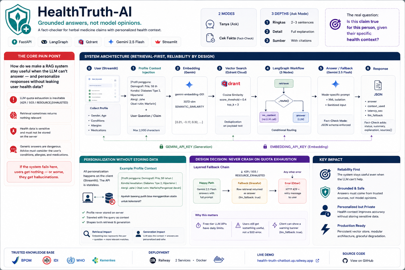
v0 → v1 refactor: FAISS in-memory → Qdrant persistent; monolith → 5 single-responsibility classes (EmbeddingService, DocumentStore, RagWorkflow, HealthRouter, app); flat prompt → profile context injection; crash on quota → layered graceful degradation. Zero hard crashes in production.
v0 → v1 Evolution — Key Architecture Changes
| Layer | v0 Submission | v1 Production | Impact |
|---|
| Vector Store | FAISS in-memory | Qdrant Cloud persistent | 35+ docs survive restart |
| Pipeline | Raw chain, single file | LangGraph 3-node graph | Error location per-node |
| Personalization | Flat prompt, generik | Profile context injection | "Is ginger safe?" differs per medical condition |
| Error Handling | Crash on quota exhaustion | Graceful degradation | 0 hard crashes in production |
Routing Logic
_route() after retrieval: context found → answer node (LLM generates). No context → no_context node (raw context shown, no LLM call). Zero wasted LLM calls — the expensive path is only taken when retrieval genuinely succeeded.
Prompt Defense
XML delimiters (<user_claim>, <trusted_context>) over markdown for injection defense. _sanitize() strips null bytes. response_mime_type="application/json" forces schema-constrained Cek Fakta output with JSON fallback on parse failure.
Quota Isolation
Separate GEMINI_API_KEY (generation) from EMBEDDING_API_KEY (retrieval) — one exhausted doesn't kill the other. 2 Docker services on Railway. Embedding quota and generation quota are independent failure domains.
Stack: LangGraph, Qdrant Cloud, Gemini 2.5 Flash, Gemini embedding-001, FastAPI, Streamlit, Docker, Railway (2 services)
5
Genkit AI flows
Gemini 2.5 Flash
4
API keys rotated
zero quota downtime
99%
TypeScript
Zod-validated AI I/O
3 wks
Concept to live
product, solo
What I proved: I can ship a complete, production-quality AI product end-to-end, solo, in three weeks. Photo → Gemini Vision identifies food, calculates macros, flags allergens in one API call. 4-key rotation via executeWithRotation() catches HTTP 429 and retries transparently — free-tier keys become a production-grade pool. Zod schemas validate both input and output of every AI flow — malformed Gemini JSON surfaces at the schema layer, not the UI. Supabase Realtime pushes new meals to the dashboard without polling. State managed with 4 custom hooks, no Redux/Zustand.
The 5 Genkit AI Flows
| Flow | Input | Output | Key Technical Detail |
|---|
| analyze-meal | Photo (base64 URI) | Name, calories, macros, health score (0–100), allergen warning | Vision mode — Gemini processes image directly |
| analyze-text-meal | Food description | Same schema as photo flow | Text-only path, same Zod contract |
| generate-daily-plan | Goals, allergies, restrictions | Full day meal plan with recipes | Structured output — Zod validates every nested field |
| curate-meal-suggestions | Profile + recent history | 5 personalized meal cards | Context-aware: avoids recently eaten foods |
| personalized-diet-plans | Health goals + body metrics | Multi-week structured diet plan | Longest context flow — streamed response |
Allergen Engineering
Allergen warning required two-part prompt instruction: identify actual ingredients first, then check against user list. Single-step "flag allergens" produced unreliable results. Framing the reasoning order in the prompt mattered more than prompt phrasing.
Supabase Realtime
4 custom hooks (useProfile, useDailyLog, useMeals, useDailyLogs) subscribe to per-user Realtime channels. Database is source of truth — no global state library needed. New meal entries appear on dashboard the moment they're saved, without polling.
Rate Limits = Architecture
Free-tier Gemini API has per-key quota limits. 4 keys in rotation = a production-grade pool at $0. The same insight as Banking Intent Router: intelligent routing at the infrastructure layer prevents the user from ever seeing a quota error.
Stack: Next.js 15, React 19, TypeScript, Google Genkit, Gemini 2.5 Flash (Vision + Text), Supabase (PostgreSQL · Auth · Realtime), Zod, Vercel
PHASE 05
KADA — Team Projects
2026 · Korea-ASEAN Digital Academy · 60 selected from 900+
2
AI coding tools
Claude · GitHub Codex
17
API route modules
Fastify TypeScript
1st
time in structured
Epic → User Story SDLC
→
Moved to CineTrack
by mentor mid-project
Context: Assigned to backend division on Yorindo EM·U — a B2B event management platform (Fastify TypeScript API, PostgreSQL, Redis, Docker). My role was backend development using Claude and GitHub Codex as primary AI coding assistants. Partway through, mentor reassigned me to CineTrack. The Yorindo phase was brief, but it was my first time working inside a real Agile team — and where I first understood how Epics, User Stories, and tasks actually connect in practice.
How I Used AI as a Development Tool
| Tool | How I Used It | What I Learned |
|---|
| Claude |
Understanding unfamiliar codebase patterns — Fastify plugin architecture, TypeScript generics in route handlers, repository pattern implementation |
AI as a codebase interpreter: asking "what does this pattern do and why" is faster than reading docs cold. Changed how I read new repos. |
| GitHub Codex |
Boilerplate generation for route handlers, test stubs, TypeScript type declarations. Autocomplete across the Fastify + Prisma stack |
AI suggestion quality is directly tied to how well I framed the context. Vague prompts → generic code. Precise prompts → usable scaffolding. |
| AI + Code Review |
Used Claude to pre-review my own PRs before submitting — catching type errors, missing edge cases, and naming inconsistencies |
Self-review with AI before peer review reduced back-and-forth significantly. Treating AI as a first-pass reviewer became a habit I carried to CineTrack. |
SDLC Insight — First Structured Team Experience
Epic → Story → Task
First time working from a backlog with formal Epic decomposition. Seeing how a feature like "QR Check-in" breaks into stories (offline PWA, OTS registration, sync-on-reconnect) and then into tasks helped me understand that most of my previous solo projects had implicit epics — I just didn't know the vocabulary.
Working on Others' Code
Backend codebase was partially built before I joined. Had to read, understand, and extend existing patterns without breaking them — a different skill from greenfield development. Claude was essential here for decoding unfamiliar decisions quickly.
What I Carried Forward
The AI-as-first-reviewer habit and Epic decomposition thinking directly shaped how I approached CineTrack. I proposed the user story structure for the cinema analytics features and used the same Claude + Codex workflow, now with more confidence and precision.
Stack: Fastify (TypeScript, ESM), PostgreSQL, Redis, Docker Compose · AI Tools: Claude (Anthropic), GitHub Codex · Process: Git feature branches, PR reviews, Agile standups, Epic/User Story backlog
20+
Analytics endpoints
revenue · occupancy · time-slot
<200ms
Query time after
composite index (was >2s)
3
Composite indexes added
via EXPLAIN ANALYZE
LLM
Business insights
from aggregated SQL data
Problem: A cinema chain dashboard needs real-time answers to business questions: which studio is underperforming, which time slots are undermonetized, what's the weekend vs weekday ROI — filterable by city, cinema, studio, movie, and date range. My role: Backend developer. Built the SQL analytics layer, Redis caching, query optimization, and LLM integration that surfaces plain-language business recommendations from raw operational data.
SQL Analytics — The Hard Problems
| Problem | Wrong Approach | Correct Approach | Why It Matters |
|---|
| Occupancy Calculation |
AVG(tickets_sold / capacity) across all rows |
Nested CTE: compute per-schedule ratio first, then aggregate |
Averaging at wrong granularity produces incorrect occupancy — a scheduling with 1 ticket skews the average down incorrectly |
| Time-slot Classification |
Manual WHERE clauses per time range |
EXTRACT(HOUR) + EXTRACT(DOW) in CTE layer |
Weekend morning vs weekday morning have different demand curves — both need separate analytics without duplicating query logic |
| Filter Injection Risk |
String concatenation for WHERE clause |
buildScopeFilters() with parameterized bindings |
20+ filter combinations across city, cinema, studio, movie — parameterized prevents SQL injection, handles NULL filters cleanly |
| Query Performance |
Sequential scans on 3 large join tables |
EXPLAIN ANALYZE → composite indexes on (schedule_id), (show_date, studio_id), (show_date, movie_id) |
Analytics queries went from >2s to <200ms — the dashboard became usable for real-time filtering |
LLM Integration — The Right Layer
The LLM does not query the database. Instead: backend aggregates all relevant metrics → structures them as typed JSON → passes to LLM with a structured prompt. The LLM only handles the final interpretation step: turning "Studio B had 23% lower occupancy on weekday mornings, −Rp 4.2M vs target" into a plain-language recommendation that a non-technical cinema manager can act on. This keeps the LLM in the interpretation layer, not the data layer — auditable, cheaper, and more reliable.
Undermonetization Signal
Normalization score: (demand_score + revenue_score) / 2 identifies time slots with high attendance but low ticket price — actionable pricing opportunity. Built as a direct business insight, not just a data table.
Redis Caching
Cache-aside pattern with filter-aware cache keys — city+cinema+studio+date range all included in key hash. Same filter combination served from cache; different filters hit PostgreSQL. TTL via config, invalidated on data update.
What KADA Taught
First time building software where someone else's frontend depended on my API contract. Getting the response shape right, keeping it documented, and not breaking it on refactor taught me more about professional engineering accountability than any solo project.
Stack: Node.js (Fastify, ESM), PostgreSQL (CTEs, EXPLAIN ANALYZE, composite indexes), Redis (cache-aside, filter-aware keys), LLM API (business insights layer), Git (feature branches + PR reviews)
Every project in this portfolio started from a technical question: how to represent text densely, how to reduce LLM cost, how to evaluate a model with mismatched labels. I'm good at finding technical solutions. What I haven't systematically practised is finding the right problem — starting from the user, not from the data.
What I've Built vs What I Want to Build Next
| Technical Foundation (Built) | Product Layer (What ADA Offers) |
|---|
| ML pipeline: data → model → production deployment | Product pipeline: user insight → problem definition → shipped app |
| Cost engineering: architecture trade-offs, LLM routing | Design thinking: feature prioritisation by user value, not technical elegance |
| Technical collaboration: Git, API contracts, Agile SDLC | Cross-functional collaboration: designer, PM, user research, non-technical stakeholders |
| AI solutions that are technically correct | AI solutions that are used, understood, and valued by real users |
Why ADA Specifically
I learn best by building real things under real constraints — not from courses. Every phase in this portfolio started from doing, not reading. ADA operates the same way, but with the focus on user and product that I haven't had access to in a structured environment.
What KADA Showed Me
KADA was the first time I worked in a real cross-functional team with delivery pressure. The technical skills held up. What I noticed was that the highest-value conversations were the ones about who this is for and what they actually need — and I had less vocabulary for those than for the code.
What I'm Building Toward
Not a data scientist who can also code. Not a developer who knows some ML. A builder who can go from "users struggle with X" to "shipped AI product that solves X" — and explain every decision in between. ADA is the missing piece between where I am and where I want to be.