Applied Data Science IDCamp Intermediate · Environmental Analytics

Beijing Air
Quality Dashboard

Transforming 46 MB of hourly sensor data from 12 Beijing monitoring stations into actionable air quality insights through AQI modeling, statistical hypothesis testing, and geospatial analysis.

Type EDA · Dashboard · Statistical Analysis Stack Streamlit · Plotly · Folium · Pandas Dataset 46 MB · Hourly · 12 Stations · 2013–2017 Level IDCamp Intermediate
Beijing Air Quality Dashboard — Streamlit interface showing AQI trends, pollutant analysis, and geospatial map across 12 Beijing monitoring stations
12
Monitoring stations
across Beijing
46MB
Hourly sensor data
2013–2017
χ²11,819
Season vs PM2.5
chi-square statistic
6
AQI categories
EPA breakpoints
01 · Executive Summary

Three findings every stakeholder needs to know.

Before diving into methodology: here's what this analysis revealed that matters for policy and planning.

Seasonal pattern
Winter
December–February is the dominant pollution season. Coal heating and temperature inversions trap PM2.5 near ground level — χ² = 11,819 confirms this isn't noise.
Strongest natural cleaner
Wind
Wind speed (WSPM) showed the strongest negative correlation with PM2.5 levels across all 12 stations. High-wind days are consistently the cleanest days in the dataset.
Spatial inequality
Urban
Urban stations are disproportionately polluted. Zone type is a statistically significant predictor of AQI category (χ² = 4,600, p < 0.001) — location determines air quality outcome.
02 · Problem → Approach → Impact

Raw sensor data tells you nothing. Until it does.

Challenge

The Problem

  • Beijing's air quality is a public health crisis — but raw CSV data doesn't tell the story
  • No standardized AQI metric across the 12 raw station datasets
  • Unclear which stations or seasons should be priority intervention targets
  • Meteorological relationships (wind, rain) were assumed but never quantified
Solution

The Approach

  • Computed EPA-standard AQI from 6 raw pollutant readings per station
  • Ran Spearman correlation and chi-square tests to validate visual patterns statistically
  • Built a composite priority score to rank stations by pollution severity
  • Deployed as an interactive Streamlit dashboard with 5 analytical views
Impact

The Results

  • Seasonal signal confirmed: χ² = 11,819 for season vs PM2.5
  • Spatial inequality confirmed: χ² = 4,600 for zone type vs AQI
  • Wind identified as the dominant natural pollution dispersal factor
  • Geospatial map surfaces highest-priority stations for intervention
03 · Data Pipeline

From 12 CSV files to EPA-grade AQI.

Every step from raw sensor readings to dashboard-ready insights.

AQI Calculation

The EPA uses piecewise linear interpolation to convert raw pollutant concentrations into sub-index values. The final AQI is the maximum across all pollutants:

AQI = max(AQI_PM2.5, AQI_PM10, AQI_O3, AQI_CO, AQI_NO2, AQI_SO2)

Six categories from Good (0–50) through Hazardous (301+). This standardization makes all 12 stations directly comparable despite raw measurement differences.

Priority Score Formula

Each station receives a composite score using Z-score normalized values:

priority = 0.5 × PM2.5_z + 0.35 × AQI_z + 0.15 × gas_index_z

This weighted score drives the geospatial map — stations needing the most policy attention are immediately visible as large, high-priority markers.

Dashboard
Streamlit
Viz
Plotly
Maps
Folium
Data
Pandas · NumPy
Stats
SciPy
04 · Analysis Framework

Three analytical lenses, one complete picture.

📈
Temporal Analysis

When does pollution peak?

  • Hourly AQI patterns
  • Monthly trend lines
  • Seasonal decomposition
  • Critical period detection
🌦
Meteorological Analysis

What drives pollution levels?

  • Wind speed correlation
  • Rainfall washout effect
  • Temperature & pressure
  • Spearman rank correlation
🗺
Spatial Analysis

Where is it worst?

  • 12 station comparison
  • Urban vs suburban vs rural
  • Priority scoring map
  • Zone chi-square test
05 · Dashboard Showcase

Five views, one coherent story.

View 01 — 02

KPI Dashboard & Trend Analysis

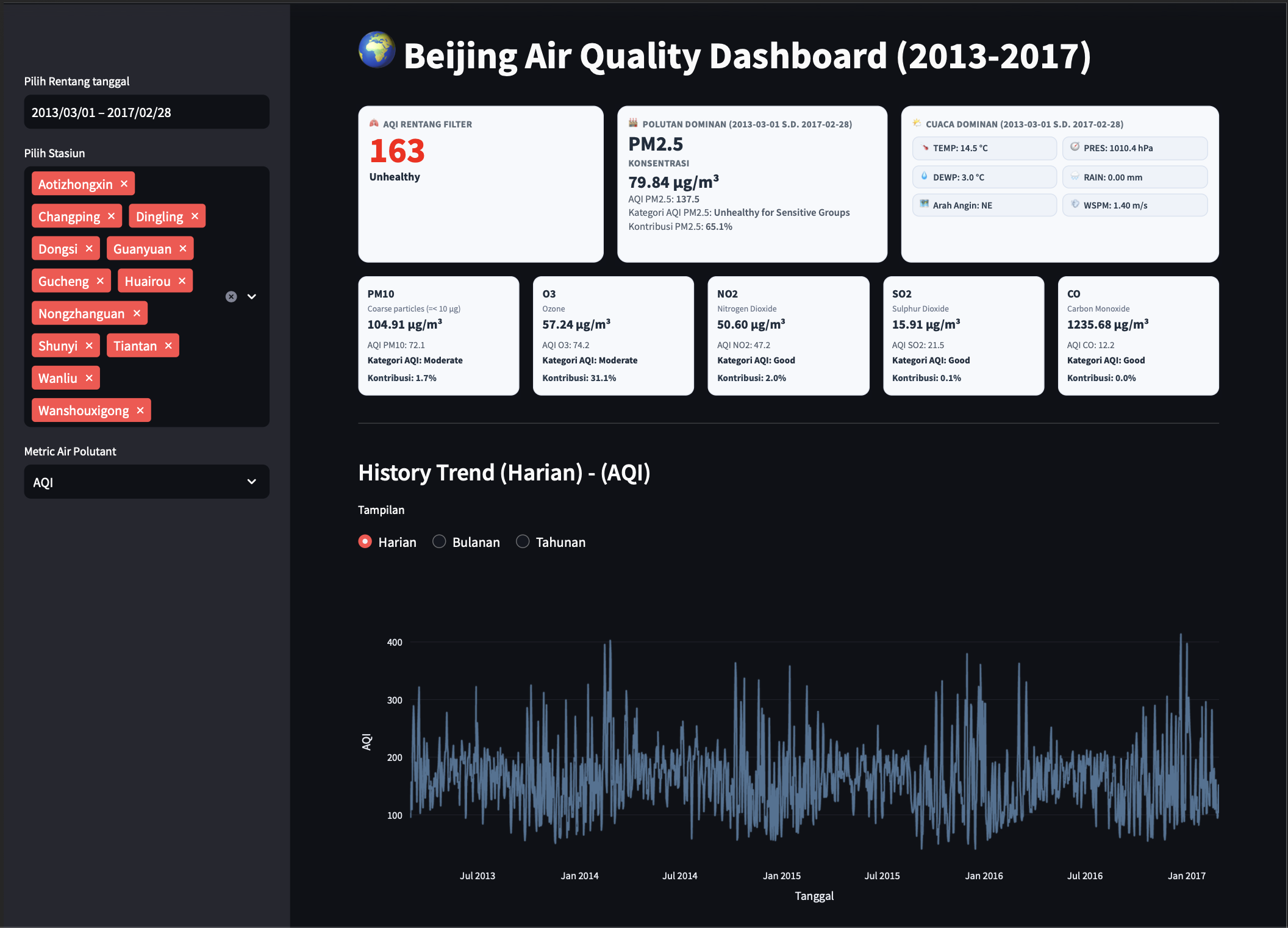
The entry point: current AQI status, dominant pollutant, and weather profile at a glance. Daily, monthly, and yearly AQI views are switchable via toggle — the hour-of-day × month heatmap makes winter-morning pollution patterns immediately visible.

KPI Dashboard and Trend Analysis — AQI status, dominant pollutant, heatmap of hour-of-day vs month pollution patterns across Beijing monitoring stations
View 03

Meteorology Analysis

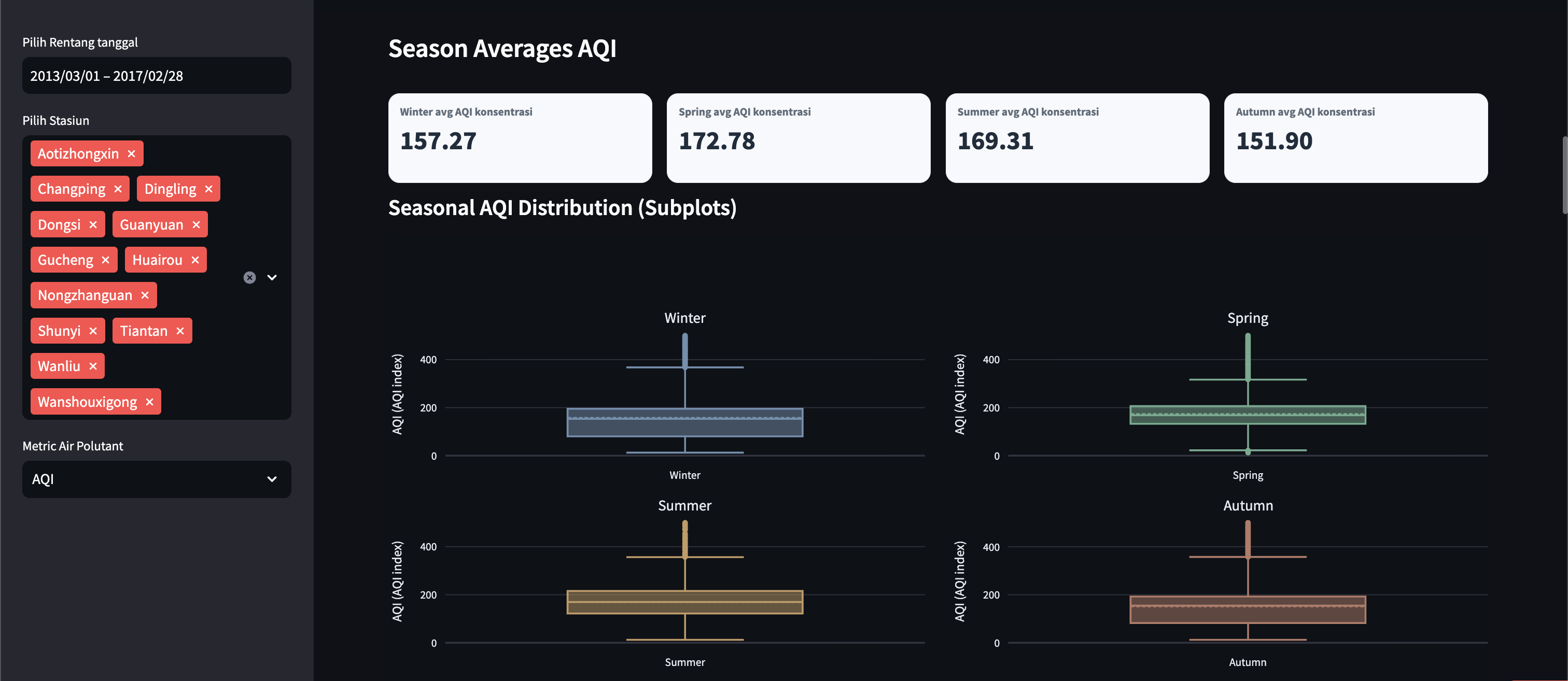
Spearman correlation heatmap and wind rose diagram answer: does rain help? (yes) does high pressure trap pollution? (yes). Box plots show seasonal PM2.5 distributions across all stations.

Meteorology Analysis — Spearman correlation heatmap, wind rose diagram, and seasonal PM2.5 box plots across 12 Beijing air quality stations
View 04

Geospatial Priority Map

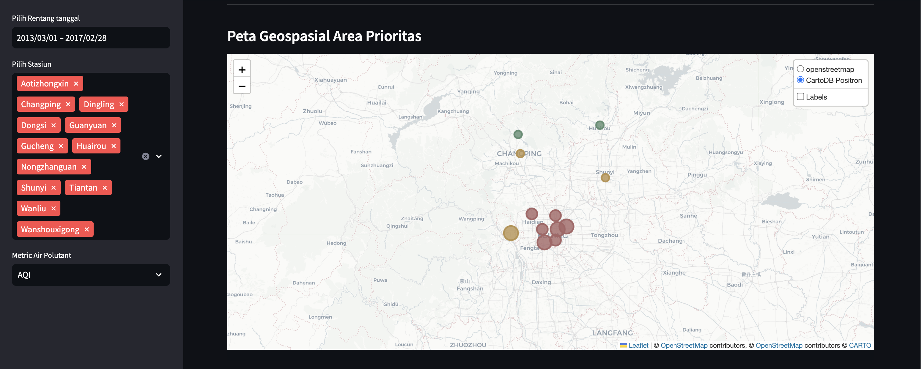
Interactive Folium map where circle size = PM2.5 level and color = priority tier. The urban cluster stations visually stand out — no explanation needed to see which zones need policy attention first.

Geospatial Priority Map — interactive Folium map showing 12 Beijing stations with circle markers sized by PM2.5 and colored by pollution priority tier
View 05

Categorical Analysis

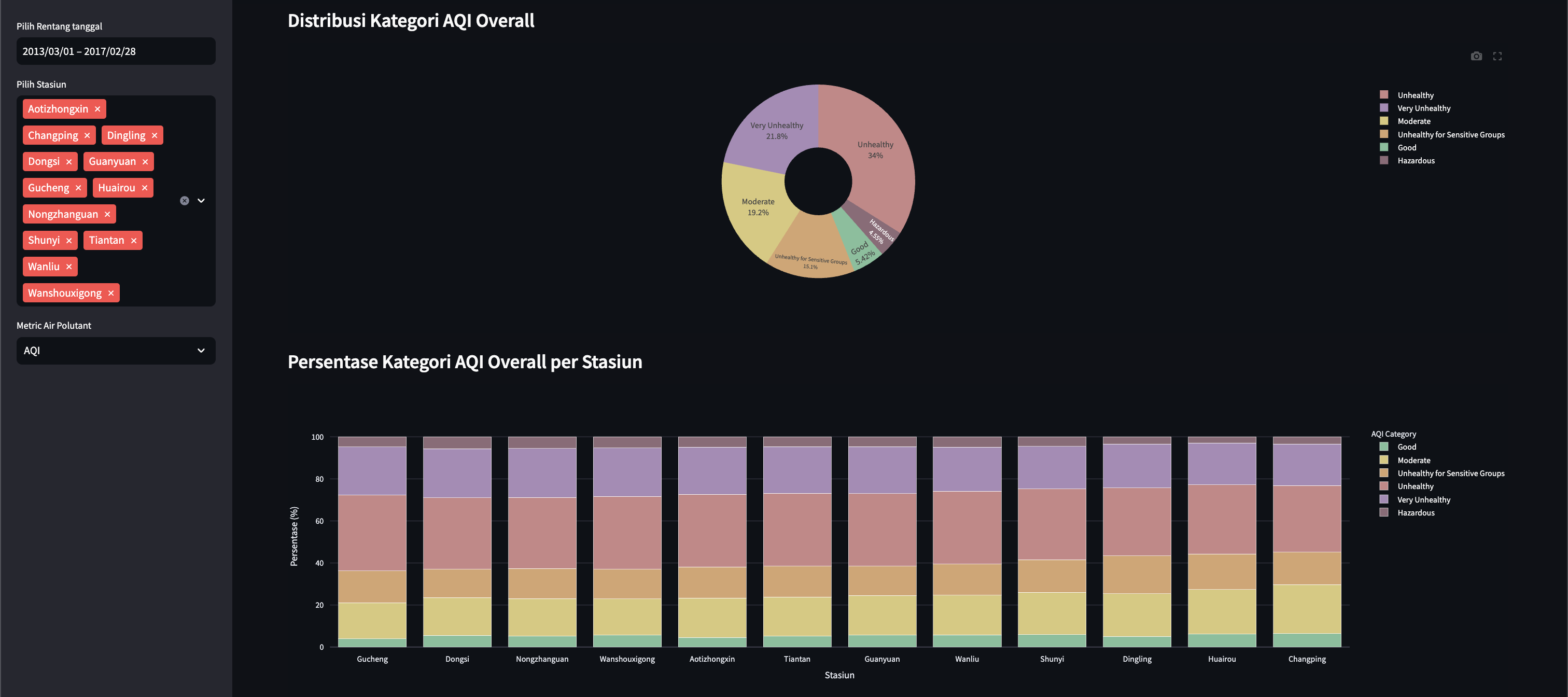
Zone type vs AQI category contingency table with chi-square output. Confirms statistically that where a station is located (urban/suburban/rural) is a genuine predictor of its AQI outcome — not just a visual impression.

Categorical Analysis — zone type vs AQI category contingency table with chi-square test output confirming spatial inequality across Beijing monitoring stations
06 · Key Findings

What the data actually proved.

Seasonality
Winter = highest AQI
χ² = 11,819 · p < 0.001
December–February is the dominant pollution season. Coal heating and temperature inversions trap PM2.5 near ground level. This is statistically confirmed, not just visually observed.
Meteorology
Wind reduces PM2.5
Strongest negative Spearman ρ
Wind speed (WSPM) showed the strongest negative correlation with PM2.5 of all meteorological variables. High-wind days are reliably the clearest days across all 12 stations.
Spatial inequality
Urban > rural AQI
χ² = 4,600 · p < 0.001
Urban stations are disproportionately polluted compared to suburban and rural zones. Zone type is a statistically significant predictor of AQI category — location determines outcome.
Rainfall effect
Rain cleanses PM2.5
Wet deposition washout
Rainfall events show measurable PM2.5 reduction in hours following precipitation. The wet deposition washout effect is clearly visible in the sensor time series.
Station hotspot
Highest priority: urban cluster
Composite priority score
The priority scoring model surfaces stations requiring immediate policy attention — combining PM2.5 (50%), AQI (35%), and gas index (15%) into a single actionable metric.
Critical period
Morning + winter = worst
Heatmap: 06:00–10:00 Dec–Feb
The hour-of-day × month heatmap shows that winter mornings (06:00–10:00) consistently register the highest AQI values — the compound effect of overnight accumulation plus morning activity.
"The chi-square result alone — χ² = 11,819 for season vs PM2.5 — shows that seasonal patterns aren't noise. They're the dominant signal in this dataset."
07 · Technical Decisions

Every choice has a reason.

Three non-obvious design decisions that shaped the validity of this analysis.

Decision Alternative considered Why this choice
Spearman correlation Pearson correlation Meteorological data is non-normal and non-linear. Pearson assumes both. Spearman rank correlation is more honest for this kind of skewed sensor data.
Composite priority score Rank by PM2.5 only A single pollutant misses the full picture. The weighted composite (PM2.5 50%, AQI 35%, gas index 15%) gives a more complete view of which stations need policy attention most.
IQR outlier detection Z-score cutoffs Sensor data includes real extreme events (dust storms, industrial incidents). IQR is more conservative — preserving genuine extremes while flagging sensor malfunctions.
Chi-square for zone/season Visual inspection only Visual patterns are hypothesis, not proof. Chi-square tests with p < 0.001 convert the observation into a statistically validated finding.
08 · Learning Journey

This submission was rejected once — then passed.

This dashboard is the capstone for Belajar Fundamental Analisis Data — IDCamp 2025 Intermediate level on Dicoding. The first submission was rejected. Here's what changed.

❌ Submission #1 — Rejected
Business questions not Time-bound (SMART criteria)
EDA missing skewness, kurtosis, Q-Q plots, Shapiro-Wilk
No chi-square tests for categorical associations
Dashboard lacked dynamic time filters
✅ Submission #2 — Passed
All questions scoped to "2013–2017 period"
Full EDA: univariate + multivariate + normality tests
Chi-square tests added — χ² = 11,819 and χ² = 4,600
Interactive filters for station, date range, pollutant
09 · Future Development

From descriptive analytics to predictive action.

The current dashboard explains what happened. The next phase is predicting what will happen — and flagging it before it does.

NOW
Dashboard Analytics
AQI trends · spatial map · chi-square
01
AQI Forecasting
weather-based predictive model
02
Automated Alert System
PM2.5 threshold · critical period flags
03
Policy Recommendation Engine
station-level intervention priorities
Try it · See the code

Interactive dashboard on Streamlit.

Explore 12-station Beijing air quality data — AQI trends, seasonal patterns, meteorological correlations, and a geospatial priority map. All from 46 MB of hourly sensor readings.